Manta Ray ID Project
My first free-lancing project has just launched, so I’m doing a quick write up of the tech used, before/after, etc. I’m pretty pumped that it went so well and it’s my first project freelance. Look at the cool thing I made!
Quick Facts:
Website: http://www.mprf.net/identification/index.html
Github: https://github.com/Dthurow/manta-ray-id-project
Tech: VueJS https://vuejs.org/
The Beginnings
Several months ago, I went to a local women in tech get together for a social lunch. I got to talking about how I recently quit my job at SPIE to do some freelancing and travel, and that I was looking for projects. Another woman there, Janice, mentioned the non-profit she co-founded was just starting to spin up a revised version of their manta ray identification website.
The non-profit is the Manta Pacific Research Foundation ( https://www.mantapacific.org/), where they research, educate, and work on conservation concerning manta rays and the marine environment.
As part of that work, they had spun up a Manta Ray identification project, where they record specific mantas’ info, name them, and track recent sightings in Hawaii. They’ve had a statically generated website for the last couple years, and have just recently launched an iOS app ( https://www.mantarays.info/) that lets users browse their saved manta info. The idea is that scientists and laypeople can learn about mantas, identify which ones they see on trips out on the water, and report sightings.
Janice had created the iOS app, but hadn’t had much experience with recent web development practices, and was hoping to find someone she could work with. She’d already worked with another CSS-focused developer who had created an initial mock-up style site, but it wasn’t hooked up to the API back-end, and still needed more info and pages. That’s where I came in.
I’ve never thought much about manta rays, but I like working with nonprofits (at least, I liked working with SPIE), and the project seemed both possible to do and interesting. The idea was to generate a website with functional parity of the current site, but with a better design, and made in such a way that future functionality could be added on simply. Their original site was pretty rudimentary. It was statically generated, so adding more mantas required generating more static html, and it frankly looked very statically generated.
Originally, since there wasn’t a strict due date for the project and I was planning on traveling this year, I’d work on it when I had time and we’d launch whenever. Circumstances have changed, and I ended up having more time than originally planned, so we got to launch it early! I’m really trying to focus on that silver lining bit right now… So, without further ado:
Original Site
First, I had to see what the old site did. The site had three main sections. A home page, which simply listed links to all mantas in a particular region. In this case, Kona, which is what the new site focused on copying. In the future, the same code will be updated to work with other locations they track manta, which was something I kept in mind as I programmed.
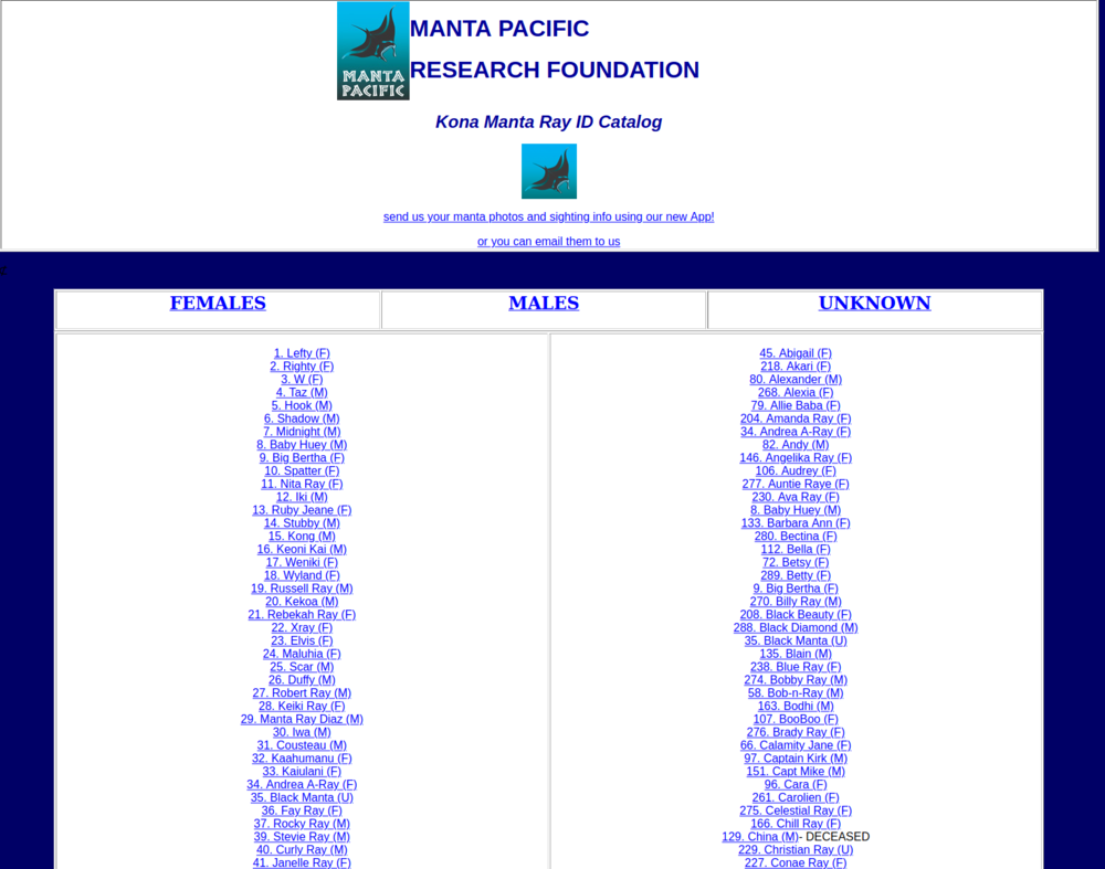
A snippet of the home page. It continues on with a list of links to display all ~300 mantas
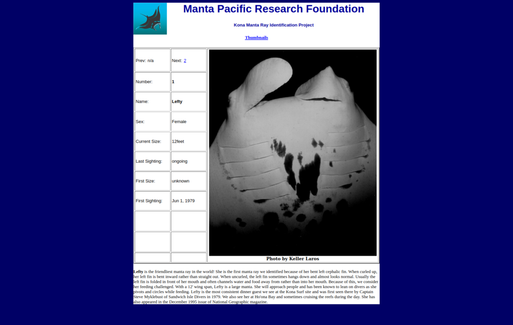
Clicking on an individual link would lead you to the detail page, a table with basic manta info and a picture of the manta
Lastly, there was a separate page that displayed thumbnail images of the mantas, for ease of identification if you didn’t know the name.
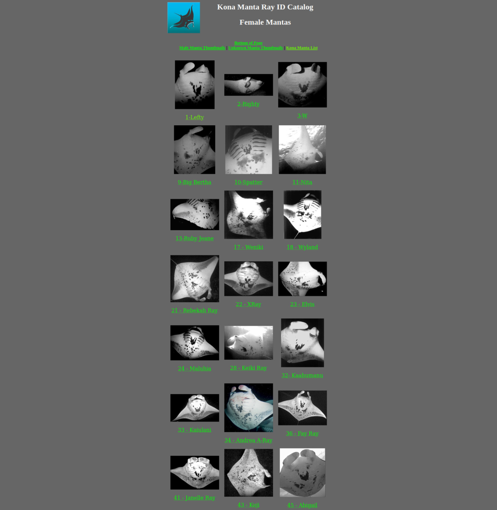
This, too, continues on to show a thumbnail of all ~300 mantas. Also cropped for display purposes.
New Site
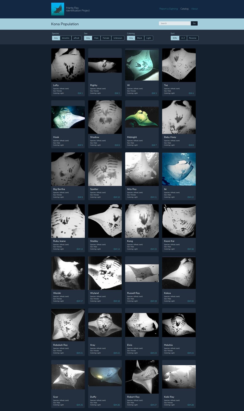
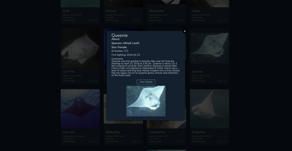
The new site moves and combines the original functionality, and adds some extras as well. First, the home page now displays all mantas in the region with a thumbnail image of the manta, for quick identification. It also lets you filter the display, and search for specific manta by name. Clicking on the displayed thumbnail opens up a pop-up with a bit more info, and lets you link to the detail page about that particular manta.
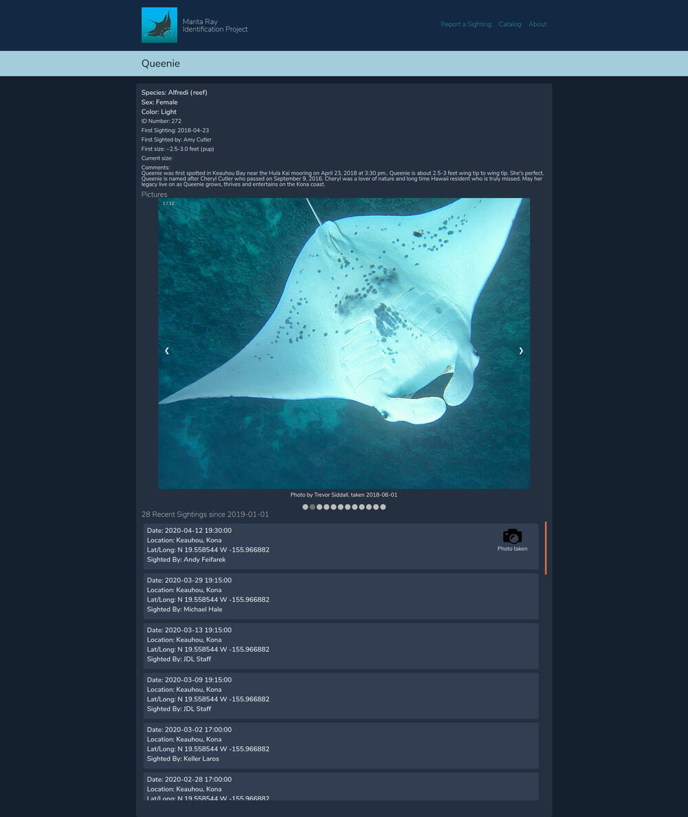
Going into the detail page, you get the same info as the original detail page, as well as all the pictures of the manta in a slideshow, and a list of recent sightings of said manta. This page also has new functionality over the old site. The slideshow of pictures is new, letting you click them to view full-size, and gives you even better ways of ID’ing the manta. Loading the sightings is new as well, and pulls design and functionality specs from the new iOS app. It pulls all the sightings since the beginning of 2019, and tells you who saw it when, and if they grabbed a picture during the sighting.
Instead of a statically generated detail page per-manta, there’s a single detail page, which decides which manta ray will load based on the query string’s ID parameter. This keeps the site simple, and as a bonus, allows users to reference individual manta detail pages directly by a URL (a required functionality the old site had as well).
Tech Set-up
Because this site will not have a large dedicated programming team to maintain it, I tried to closely follow the KISS principle in my tech choices. I chose to use a lightweight javascript framework (VueJS) for pulling in the data from the API and creating on-the-fly HTML elements. I wrote vue code directly in the html and javascript files, with no transpiling. So no nodejs or npm, and no webpack or other transpiler tooling. The site itself is just static HTML/CSS/Javascript that can be hosted by any server, and I pulled down copies of the the third-party javascript and CSS so they’d be hosted locally, so the Manta Foundation wouldn’t have to worry about upgrading the site when the versions I used were deprecated and taken down from CDNs. Now as always, if you don’t upgrade your third-party tools, there’s a danger of having security issues that are not patched on your site. However, the trade off for this seems to make sense. The security risks for this project is low, and decoupling the third-party CDNs from this project seems the best option to make sure this site stays up with minimal maintenance issues.
Originally I was tempted to write this site in pure javascript/CSS/HTML, no frameworks included. However, I really like having a nice templating setup for generating DOM elements on the fly, and frankly, pure javascript’s syntax feels more wordy than it needs to be for the functionality that I had to add.
Code Organization
The site has three html files: index, detail, and about. The about page is a static page, and the other two have a corresponding javascript file with the vue code: site.js and detail.js respectively. Index and detail html pages have the vue template code (using double brackets to reference vue javascript properties), and their corresponding javascript files have the Vue object, calls to the API, and calculated properties that the html pages use.
Each page follows a pretty simple flow. On load, the VueJS in the javascript files fires off an API call to get the manta collection or manta details. Then, because of how the API is set up, it then fires off a separate API call to get info on the file path to the image(s) it needs to display. The VueJS in the html has some simple templates to create the thumbnail, detail popup, and images slideshow, depending on the page.
Things I’d do differently
Honestly, not much. I still think VueJS was the right choice of frameworks. There are some streamlining speed-ups I would have liked to add. Currently the home page loads all ~300 mantas immediately, and since I have to do a separate API call to get the image path to load, that’s a lot of network traffic. Since you can only see the first few thumbnails, it would be nice to change it to load just the first few first, then slowly load the rest as the user scrolls down.
From a non-tech side, I think mainly I’d just come up with a better way of organizing my TODOs and info on the project. Normally I’m much more organized, but since this was such a simple project, I felt the overhead of organizing it was more than I needed. I’m used to paid-for slack instances, and defaulted to just looking back on slack conversations for info. Which doesn’t work well when you’re chatting on a free version that deletes messages!
Conclusion
So all in all, this was a fun little project! I enjoyed working with Janice and the technical and business side was interesting. The Manta Pacific Research Foundation plans on expanding the website with additional functionality, so hopefully I’ll get to work on this more in the future as well!
If you have a project similar to this one that needs to be done, feel free to contact me at Dan.thurow@gmail.com